
| |
| |
|
Search
|
Exhibitions
|
Textual Research
|
News
|
Featured South African Artist's Book
Online Resources | Booknesses Archive | Samplings Archive | Sign up |

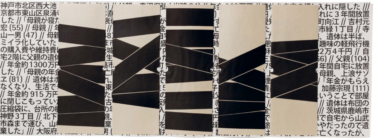
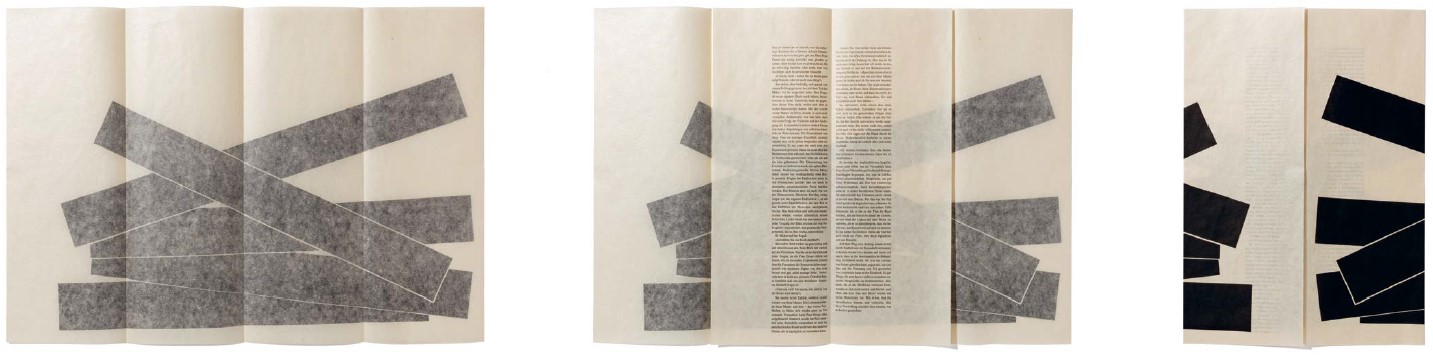
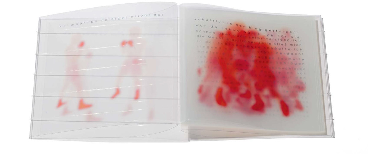
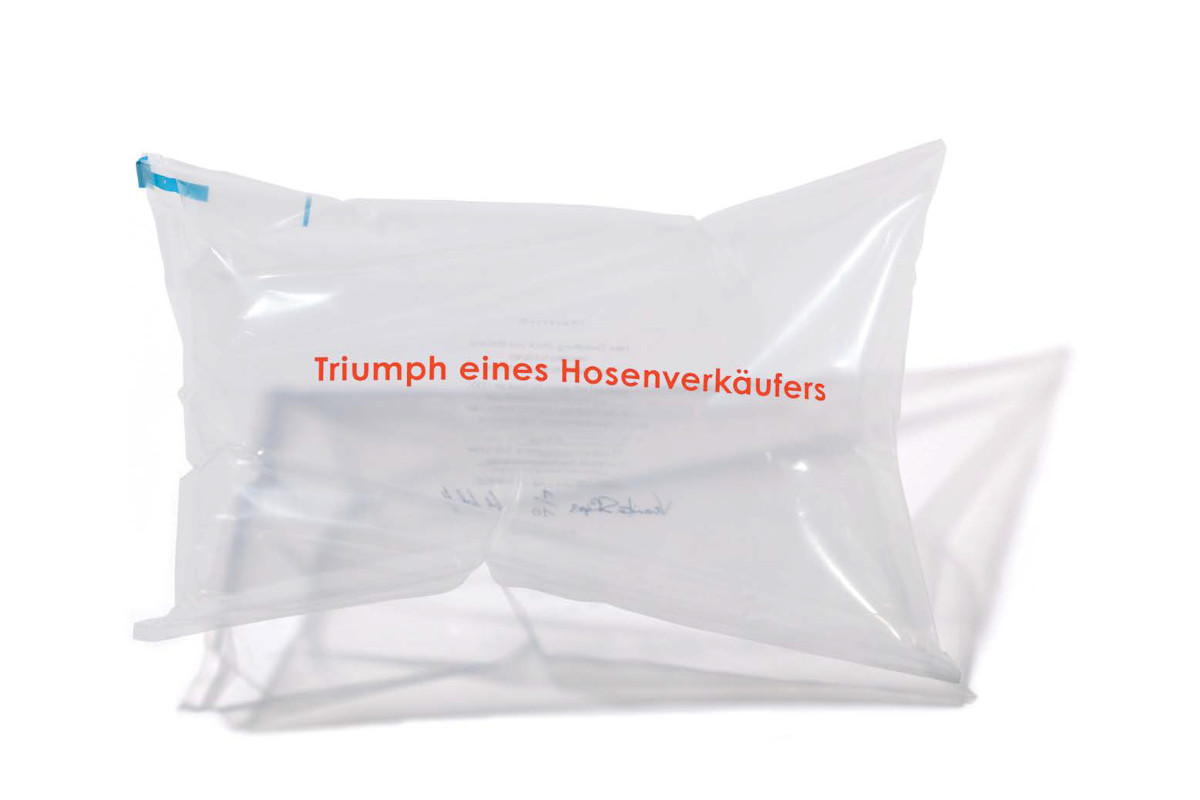
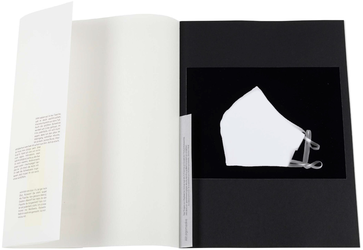
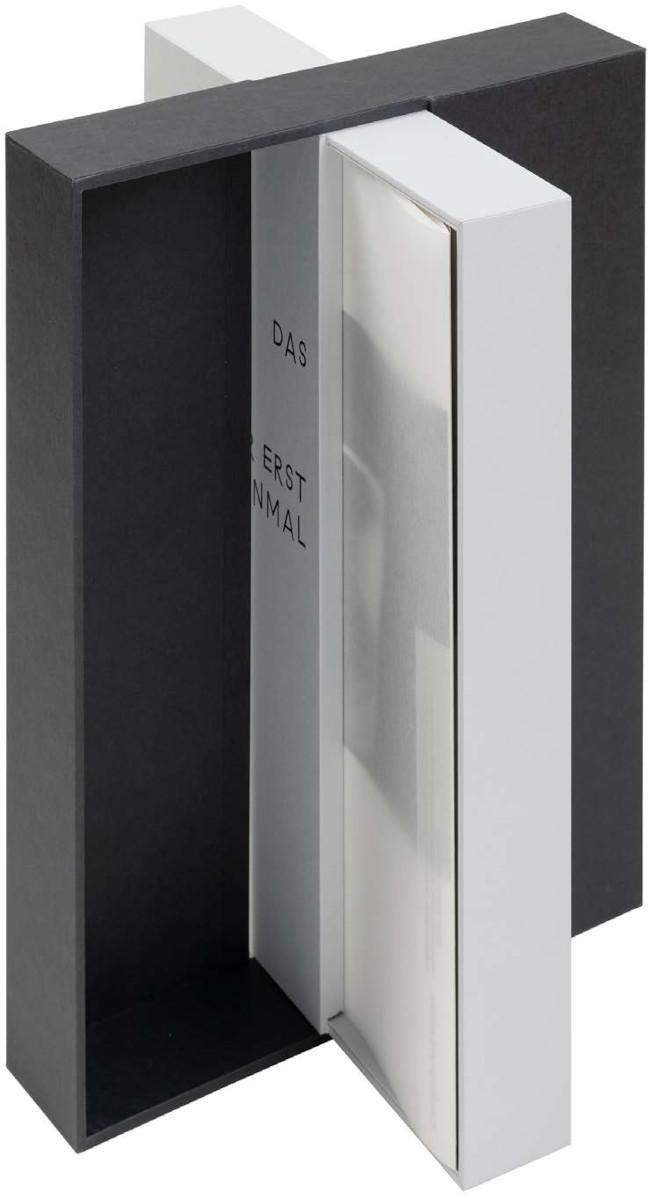
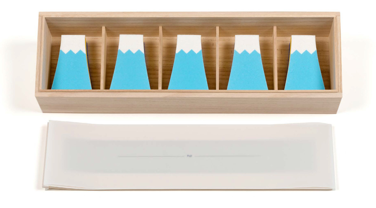
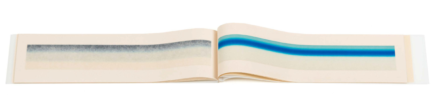
Creative Research: The Artists' Books of Veronika Schäpers, Robbin Ami Silverberg
| |||||||||||||||||
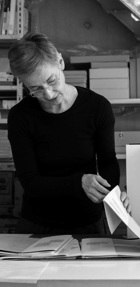
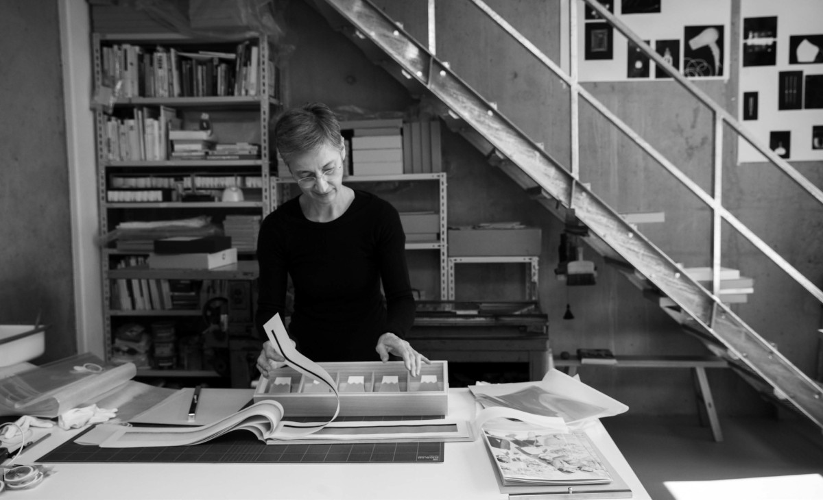
Veronika Schäpers
| |||||||||||||||

© Jack Ginsberg Centre for Book Arts (JGCBA). All rights reserved. |